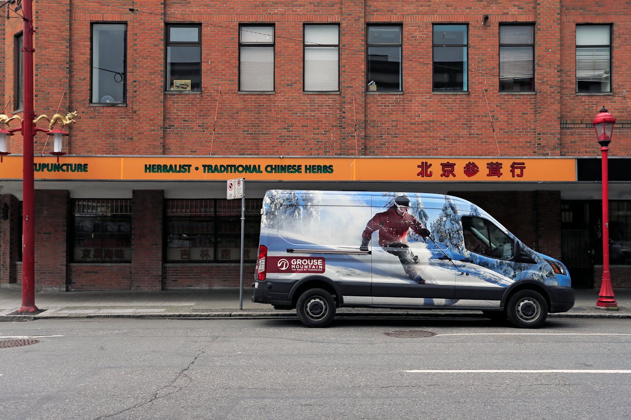
Design tips that ensure vehicle graphics remain crisp and legible on the fly make your message pop in the grind of actual traffic. Design tips to keep vehicle graphics clean and readable in motion. You get more bang for your buck when your graphics are clean and uncomplicated, so they stand out, and people can digest your message at a glance. Big bold type and simple illustrative icons are better than small text or complicated patterns. Design decisions such as spacing and matte finishes reduce glare, so details remain easy to discern from a distance. These basics apply equally well to any vehicle, be it cars, vans, or trucks. Next, let’s see these strategies in action.
Key Takeaways
- For design ideas that keep vehicle graphics crisp and legible even in motion.
- Employ bold type and high-contrast color combinations so your branding stands out from a distance and in any light.
- Acclimate your designs to the vehicle’s shape and account for the viewing angle from multiple directions.
- We select the most durable vinyl and optimum finish sheen to keep colors vibrant and to extend the life of your graphics.
- Use reflective assets smartly to enhance visibility during the night without compromising the design.
- Make sure to test your designs in real-life conditions, such as speed, angle, and light, before you commit to your vehicle graphics.
Why Mobile Billboards Work
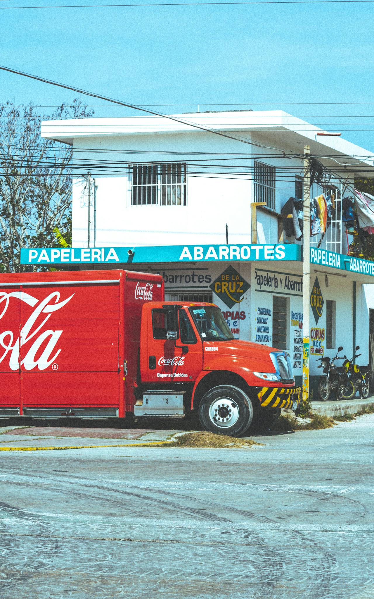
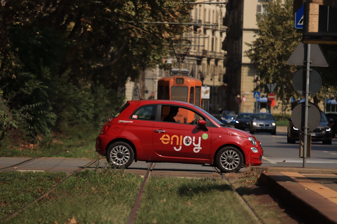
Mobile billboards rule because they catch eyes where people work, live, and relax. Custom vehicle wraps convert cars, vans, or trucks into mobile billboards. As they drive or just sit, they go by residences, worksites, schools, and busy roads. This means your message is in front of thousands every day, even if it’s only for a few seconds at a time. This exposure is hard to beat with either static signage or online ads that users ignore or block. The true advantage of mobile billboards is their combination of mobility and attention. Even when a van is parked outside a busy café or winding through city blocks, your brand is popping up in front of people who might never see a traditional billboard.
Mobile billboards work because mobility allows you to reach people in multiple locations. Instead of crossing your fingers that somebody drives past your sign, effective vehicle wraps go to where the people are. You can zip your message through business parks in the morning, schools during pick up, or by sports in the evening. This way, you catch different crowds and tailor your campaign to time and place. For instance, if you have a car parked by a metro station during rush hour, you’ll reach a jam-packed, eclectic group. If you want to get around particular neighborhoods, you can pre-plan those routes. Mobile billboards carry the power of location changeability, so you can shift your campaigns quickly to follow trends or local events, adding a level of versatility to your marketing.
Cost is another major advantage. From a CPM perspective, mobile billboards often cost less than TV, radio, or standard billboards. On top of it all, vinyl wraps can last three to seven years, so they’re a wise long-term investment. It’s easy to tweak the vehicle wrap design, too, so your message remains current. This cuts costs and allows you to experiment with what’s most effective. If you like, you can pair these mobile ads with social media or QR codes on the car, so folks can pop right from the street to your online shop or page.
Easy, readable, bold fonts are best. They generally have only three seconds to read your copy. Stick with simple words, large fonts, and high-contrast colors. That, along with a great logo and a brief URL or call to action, goes a long way. Mobile billboards work great for broad brand pushes as well as local deals, so you can tailor them to your needs.
Designing For The Moving Eye
Designing for cars is all about designing for the moving eye. In other words, you want to make sure your message pops, even when the vehicle is in motion.
People only have a few seconds to view your design. What you put on the car has to be sharp, big, and simple for anyone to see from far away. High-resolution photos and bold colors make your graphics pop, but too much detail can make things difficult to see. Every choice from color to font size should assist your key message in being noticed and read fast.
1. Simplify Everything
Design for the moving eye, that is, keep it simple so that people can absorb your message in under two seconds. Simplify graphics by centering on the main point and shedding clutter that doesn’t contribute. Simple icons and shapes work best because they are easy to notice and remember.
Avoid complex lines or tiny details that wash out when moving too fast. Instead, go with simple shapes, vivid logos, and only the most necessary text, such as your brand name or URL. Give your visuals plenty of breathing room to help them pop, not fade.
Focus on what’s most important. If you require a call to action, such as a phone number, make it concise and bold.
2. Maximize Contrast
Strong contrast makes your design stand out against all sorts of backgrounds and lighting. Dark text on light or light text on dark will have the most impact. Test your colors to make sure they are eye-catching even from a distance, in bright sun or gray skies.
Select crisp color combinations without being harsh. For instance, white on blue or black on yellow. Take time to preview your graphics at various speeds and angles before committing to a design.
3. Bold Typography
Choose bold, legible fonts that are easy to read on the fly. Big letters help ensure that your primary message or brand is noticed first. Use no more than a few font styles, as this clutters your design and confuses viewers.
Stay away from script or thin fonts because they smudge in motion. Stick with primitive, plain lettering and make your headline or company name the largest.
4. Strategic Hierarchy
Designing for the moving eye. Employ larger type for your brand or primary CTA. Put crucial details, such as your phone number or website, where they are accessible to the eye.
Organize your message so it flows logically, directing the eye from most to least important. Vary your font sizes to indicate importance.
5. Consider Contours
Adapt your graphics to the contours of the vehicle. Go with the curves and lines, not against them, to make your wrap look natural. Make your layout fit each vehicle model for a neat and professional appearance.
Designing for the Moving Eye. Use the sides and back of your vehicle to display your primary message, as this is what other traffic sees. Consider designing for the moving eye. What is obvious from the side might not be so obvious from behind. Modern software lets you map graphics precisely to the surface, so your wrap always looks polished.
The Physics Of Perception
Understanding how users perceive motion graphics is crucial for effective vehicle wrap design if you want your automobile designs to function on the street. Factors such as how quickly you drive, your color preferences, and even which way a person turns their gaze can affect the clarity of your communication. Every element from image size to brand colors can be the difference between stunning vehicle graphics that stand out and those that blend in.
Speed Blur
When cars go quickly, the artwork smears. You have to prepare for this. Utilize bold shapes and thick lines to ensure your message is legible, even when blurred at speed. Thin typefaces and small details disappear in motion. Go for big, simple images—remember those logos that remain visible as cars whiz past. Diagonal lines assist as well. They imply motion and energy, so your graphics seem like they’re moving even when they’re parked. Brief text. Drivers zipping by at 100 km/h aren’t going to pull over and read paragraphs. Concentrate on your brand and the most important data.
Always test your designs in the wild. Watch your car pull away and find what pops and what doesn’t. This catches what digital mock-ups gloss over.
Viewing Angles
| Angle of View | Impact on Graphic Clarity | Example |
| Front | Reduced visibility of side graphics | Only the front logo is visible |
| Side | Full message clarity | Phone number and tagline are clear |
| Rear | Partial message, some distortion | The brand name can appear stretched |
| Oblique/Corner | Mixed clarity, overlapping features | Both logo and text are partly visible |
When creating a successful vehicle wrap design, consider that people will view your car from all angles. Ensure that important information, such as phone numbers and logos, is placed where mirrors or handles won’t obstruct them. Set typography at 10 to 15 cm tall for contact details to maintain visibility from 8 to 9 meters. Always evaluate your vehicle wraps from various perspectives, whether in different parking spots or traffic.
Environmental Light
Light affects the appearance of images in custom vehicle wraps. In bright sun, some colors blur or blend into the vehicle surface, while at night or in rain, reflective vinyl increases visibility, making your prints pop even with minimal light. Opt for strong, high-contrast colors that enhance your brand identity in everyday settings. Limit your palette to three or four main tones, with one primary color for effective vehicle wrap design. This approach keeps the design crisp and ensures successful vehicle wrap outcomes. Always test your designs in various lighting conditions to ensure your brand message remains clear.
Material And Finish Impact
Material and finish decisions significantly influence the effectiveness of vehicle wraps, impacting how your car branding attracts attention and maintains the crispness of your brand message, whether the vehicle is parked or in motion.
| Material Type | Durability | Flexibility | UV Resistance | Maintenance | Cost |
| Cast Vinyl | High | Excellent | Yes | Easy | Higher |
| Calendered Vinyl | Moderate | Good | Moderate | Moderate | Moderate |
| Reflective Film | High | Good | Yes | Easy | Highest |
| Laminated Film | Very High | Excellent | Yes | Very Easy | Premium |
Vinyl Choice
Choose vinyl that maintains colors vibrantly, even after years of punishing sun or rain. Material and Finish Impact Cast vinyl stands up to tough weather and keeps your graphics looking fresh longer than calendered vinyl. A quality vinyl does not peel or bubble, so your graphics come out smooth and clean.
About Material and Finish Impact: Certain vinyl works better on curves and edges, so it fits the surface without gaps.
If your fleet consists of smaller vehicles, a lighter vinyl maintains weight and won’t influence vehicle dynamics. For bigger trucks, heavier vinyl can do the trick without issue.
Certain vinyls are designed for quick switches. They adhere securely but peel off completely if you want a fresh look. There is no sticky residue and no paint harm!
Finish Sheen
Material and Finish Effect: Sheen alters the way that your graphics are perceived. Matte finishes eliminate glare from sunlight or street lights, so text and graphics remain visible. They do well if you like a contemporary, zen aesthetic.
Glossy finishes make colors ‘pop’. They’re amazing reflecting surfaces that shimmer and sparkle and catch the eye from a distance. They can display fingerprints and grime more readily.
Color behaves differently under each finish. Glossy wraps make reds and blues pop deeper, whereas matte wraps provide a gentler appearance. Testing a sample under bright lights or at night helps you select what works best.
For that luxury feel, some brands employ satin or textured finishes. These can add dimension and make your note stand out.
Reflective Elements
Spruce it up with reflective vinyl to increase safety and turn heads after dark. Save it for critical elements such as logos, contact information, or borders so your brand shines in taillights.
Balance is the thing. Too reflective is distracting, and too little won’t be noticed. Put retroreflective pieces where they’ll best assist, such as on trucks’ sides and rear.
Night and low-light test your reflective graphics. Just be sure they comply with local regulations and look nice from all angles.
That’s why we use reflective elements that help your vehicles get noticed and keep your message readable long after sunset.
Common Legibility Mistakes
Most folks catch your vehicle graphics for a couple of seconds, from a passing car or as they stroll by. That is, your vehicle wrap design needs to communicate the message quickly. The root of the issue is readability. If your graphics are difficult to read or cluttered, audience members skip your point. Use this checklist to identify the typical errors that prevent graphics from being legible.
Cluttered designs are a major problem. When your design is crammed with words, logos, or pictures, readers get confused. Too much information muddies people’s thinking and makes it difficult to extract what’s important. Your message needs to be easy to read, with plenty of whitespace around each element so it really pops. For instance, if your custom vehicle wrap has a phone number, a slogan, five photos, and three different logos all squeezed together, people won’t have a clue where to look first. Avoid common legibility errors. Keep it clean so your key points sparkle.
Tiny type is another huge error. On a vehicle, small is hard to read even at arm’s length, never mind from across the street! Fine print, small fonts, or lengthy URLs don’t fly. Instead, make your most important info the larger, bold letters. A web address in large, plain text across the side of a van, for example, is easy to catch, whereas a long slogan in small script will get missed.
Low contrast is a very common pitfall. If your text color is close to your background color, the words blend in and vanish. High contrast makes your message pop. Consider white copy on a dark blue car or black copy on a yellow truck. This is even more critical when your design overlaps seams or curves in the wrap. If you don’t account for how panels meet, you can lose important words or elements of your design.
While fancy fonts may look nice on paper, they don’t work on a car going by at 65 miles per hour. Serif fonts, swirls, or lots of detail all slow the reader down. Avoid legibility blunders; go with simple fonts that are bold and easy to see from a distance. Limit yourself to one or two fonts at most and don’t mix styles.
Test Before You Invest
Testing is essential for ensuring your vehicle wraps maintain crisp and legible graphics while in motion. A careful test phase can save time, money, and stress before committing to a full custom vehicle wrap.
- Establish real-world tests. Test before you invest. Print sample graphics and stick them on your car. Stand back at 100, 50, then 25 feet. This corresponds to how car and foot traffic will see your visuals. Test if your message and logo pop at each distance. Attempt to keep it relatively simple, with three or four colors maximum, one of them your primary brand color. Too many colors or fancy fonts frequently fade away from a distance.
- About: Fail Fast test Before You Invest. Use mock-ups or scaled-down prototypes. Before you invest in a full-scale wrap, make a mini-wrap. This aids in identifying issues with blur, clutter, or color washing into the background. It’s less costly to correct errors at this point than after the entire wrap is complete. Place the prototype on the car and drive it around in various light conditions, such as sunshine, shade, and clouds. Watch how the design evolves. Certain colors can appear fantastic in the sun but wash out or go gray in rain or low light.
- Inspect materials and ink. Try using test prints to check the durability of materials. Test for UV resistance, water, and wear. Quality stuff ensures your wrap stays vibrant and crisp for years to come. Poor materials can peel, crack, or fade quickly, costing you additional dollars down the road.
- Request feedback. Expose the vehicle to your audience. Ask if they can read the primary message and identify the brand logo in a second or two. Hear what they’re saying about color, size, and words. Design it differently if more than one person gives you the same input.
- Try it out in all scenarios. View your design in day, night, sun, and rain. Headlights and streetlights alter the appearance of colors and words. Make sure you test your ride out on congested streets and in parking lots to get that authentic moving vehicle in the background look.
Conclusion
Great vehicle graphics pop and endure on the go. These are the design strategies that make vehicle graphics clear and readable while on the move. Choose bold contrast for readability. Simple shapes and short words work best. Even from a distance or in the shadows, the right look imprints itself on memories. Tested in real traffic, they show what really works. Crowded city blocks or open highways, your message has to slice through the hustle. Stand with brands employing smart, simple design. Keep your graphics crisp and legible. If you want your next wrap to strike true, sample it in action. Your message was meant to be noticed—make every mile matter.
Frequently Asked Questions
1. How Can You Keep Vehicle Graphics Readable While In Motion?
Utilize large bold fonts and high-contrast colors for effective vehicle wrap design. Keeping words to a minimum while avoiding intricate pictures enhances brand visibility, allowing folks to quickly read your branding as you drive by.
2. What Colors Work Best For Moving Vehicle Graphics?
Utilizing high contrast color combinations, like black on yellow or white on blue, enhances visual appeal and ensures effective vehicle wrap visibility from afar or in motion.
3. Why Does Font Size Matter For Vehicle Graphics?
Bigger fonts in your vehicle wrap design make your brand message legible from a greater distance, enhancing brand visibility while your car is in motion.
4. How Do Material And Finish Affect The Clarity Of Graphics?
Glossy finishes can create glare and hinder readability, while matte or semi-gloss materials enhance visual appeal, ensuring effective vehicle wrap design with crisp graphics.
5. What Are Common Mistakes To Avoid In Vehicle Graphic Design?
Avoid cluttered design by not overloading your vehicle wrap with text or using low contrast colors and fancy fonts, ensuring an effective vehicle wrap layout for quick message scanning.
6. How Can You Test The Legibility Of Your Vehicle Graphics?
Print out a sample of your custom vehicle wrap and try looking at it from a distance, or take pictures of your vehicle when it is moving. This mimics real-world viewing and helps you identify any legibility problems.
7. Why Is Simplicity Important In Mobile Billboard Design?
Simple designs, including effective vehicle wrap layouts, are easier to comprehend in an instant. Clear graphics and minimal words maximize your brand visibility, ensuring your message reaches more people.
Stand Out Everywhere You Drive With Vehicle Graphics & Mobile Advertising
Your vehicle is more than transportation; it’s rolling marketing. Professionally designed vehicle graphics put your brand in front of thousands of people every day, whether you’re parked at a job site or driving across town. The right graphics build instant recognition, boost credibility, and help customers remember your business long after you pass by.
At It’s A Good Sign, we bring over 30 years of experience to vehicle graphics and mobile advertising projects of all sizes. From simple logo decals to full vehicle wraps, our team handles design, production, and installation with precision and clear communication. The result is clean, eye-catching graphics that represent your brand the right way.
We take care of the details that matter most. That includes proper measurements, surface prep, durable materials, and expert installation that protects your vehicle’s finish while maximizing visual impact. Your graphics look sharp, last longer, and work harder for your business.
Vehicle graphics are one of the most cost-effective forms of advertising you can invest in. Turn every drive into a branding opportunity with a team that knows how to make your message stand out on the road.
Ready to upgrade your fleet or wrap your first vehicle? Contact It’s A Good Sign today.
Disclaimer
The materials provided on this website are for informational and entertainment purposes only and are not intended to serve as professional advice. You should consult a qualified professional for advice specific to your unique circumstances or needs. Do not act or refrain from acting based on the content on this website without seeking appropriate guidance from an expert in the relevant field.
The information presented here may not reflect the latest developments in signage, design, or related industries. We disclaim all liability for any actions taken or not taken based on the content of this website to the fullest extent permitted by law.