A seamless wayfinding system for multi-room or multi-floor spaces implies straightforward, minimalist signage and directions that allow users to navigate effortlessly. Smart wayfinding employs clear signage, maps, and color codes to display directions and identify rooms or floors. Key information, such as door numbers, arrows, and icons guide everyone, even non-native speakers. Well-lit hallways, coordinated symbols, and assisting info desks bolster direction for visitors and personnel alike. To work for all, it must be tested with real users and updated when layouts change. The below goes over steps, tips, and common tools to create a streamlined wayfinding plan that applies to multiple types of spaces.
Key Takeaways
- Good wayfinding is about knowing how people conceptualize spaces and make choices about where to go. It offers them explicit, intuitive information at the moment of decision.
- Standardized fonts, colors, and symbols across all signage create more consistency and easier recognition of guidance anywhere.
- Integrate physical signage with digital tools like QR codes, interactive kiosks, and mobile apps to provide versatile and accessible navigation assistance.
- Keep it universally accessible. Use tactile components, high color contrast, straightforward typography, and audio cues as needed.
- Consistently audit your wayfinding system and keep it in shape with long-lasting materials. Evolve as the space or your users’ needs change.
- Collect and implement user feedback to continue evolving your wayfinding approach.

Understand Wayfinding Psychology
Wayfinding is the process of navigating and making decisions about what path to take, drawing on your spatial knowledge and environmental cues to get somewhere. How we navigate multi-room or multi-floor spaces is influenced by indoor navigation systems that help us visualize these spaces, decide directions at junctures, and communicate information as we walk. Effective wayfinding strategies minimize stress, direct users toward their goals, and remain effective across ages and cultures.
Cognitive Mapping
We navigate by means of cognitive maps, which are visual images of spaces in which we literally picture a route. These cognitive maps arise from experience, signage, and environmental landmarks. Well-designed indoor maps assist users in forming these mental maps and simplify the memorization of routes and landmarks.
Floor patterns, colors, and icons aid users in connecting what they see to their own mental maps. For instance, a blue line on the floor can lead visitors from the entry to the auditorium. Such markers should conform to the way that most people visualize space, either from their own perspective or from a bird’s-eye point of view.
Cognitive load is important. If a space is too convoluted or missing obvious cues, it impedes your movement and increases tension. Easy plans and common visual cues reduce the cognitive burden and render wayfinding more effective for everyone.
Decision Points
Decision points are locations where users are required to select a path, like hall intersections, elevators, or stairwells. Directional signs here are crucial. They must indicate directions explicitly, such as arrows pointing left with the label ‘Rooms 101–110’ and right with ‘Cafeteria.’
Symbols and color coding accelerate decisions. For example, it’s very common to communicate emergency routes in red and exits in green. Studies indicate that color-coded systems can increase the rate of success from 55 percent to more than 90 percent. Symbols assist multi-lingual users or users with reading disabilities.
Pay attention to what people do at these junctures. If users pause, stumble, or turn back, signs might have to be relocated, enlarged, or use simpler iconography. Real behavior-driven changes make wayfinding smoother for all.
Progressive Disclosure
Progressive disclosure is the principle of displaying only the information most needed initially, followed by more details as users proceed. This prevents users from becoming overwhelmed. For instance, a lobby map would display just major zones. As users approach their destination, signs expose room numbers and subsequent details.
Layered maps come out great here, with general overviews around entrances and more detailed directions deeper in. Always put main paths up front, like elevators and exits, so users can calculate in advance.
Testing how people navigate with sequential signs, either in real life or in VR, detects disorientation and irons out snags. Wayfinding psychology is being adaptivetom these tests, which keeps wayfinding clear for all.
How To Design A Seamless System
A seamless wayfinding system for multi-room or multi-floor spaces, including intuitive indoor navigation solutions, eliminates confusion and stress, enabling people to navigate smoothly. Designed intelligently, it blends obvious signage, bold visual hierarchy, and integration with digital wayfinding tools. It is based on meticulous design and regular experimentation, putting the user at ease.
1. Audit Your Space
Begin with a review of all existing directional signage and technology for efficiency and visibility. Identify blind spots and areas where crowds congregate, get lost, or seek assistance, such as near lifts, stairwells, or along long corridors. By observing your users as they navigate the space, you can gain insights into their paths and note any places where they stall or retrace. These observations are crucial for enhancing your wayfinding strategy and improving indoor navigation.
2. Establish Hierarchy
Construct an obvious visual hierarchy to enhance indoor navigation and guide users towards the most crucial information initially. Design signs where the main directions, like floor numbers or exits, use larger fonts and bolder colors, while smaller signs are for restrooms or meeting rooms. Locate important signage at eye level and close to decision points, such as junctions and entryways. This thoughtful wayfinding strategy clusters the info by immediacy, aiding regular users as well as infrequent visitors in navigating indoor spaces effectively.
3. Standardize Elements
Develop a signage style guide for fonts, colors, and icons, focusing on intuitive wayfinding. Stick to basic, universal symbols, and employ consistent language across all signage, indoor maps, and digital applications. Ensure all signage complies with accessibility guidelines, utilizing high contrast, large print, and plain language for effective indoor navigation. Review these standards frequently, keeping them fresh with feedback and trend tracking from your workplace analytics and hybrid work patterns.
4. Integrate Landmarks
Identify natural or architectural features—such as reception desks, atriums, and artwork—and align your indoor navigation strategy around these anchors. Display these landmarks on indoor maps and directional signage so users can verify their location and navigate efficiently. Landmarks enhance the user experience in both digital wayfinding tools and physical navigation systems, especially for visitors seeking intuitive wayfinding.
5. Test And Refine
Conduct usability tests with actual users, including staff, guests, and newcomers, to evaluate the effectiveness of your indoor navigation system. Measure the time it takes for them to locate a room or desk, and record any stress or disorientation during their experience. Let feedback guide incremental, iterative change in your wayfinding strategy, tracking changes to quantify time saved and user satisfaction.
Harmonize Physical And Digital
A seamless wayfinding system harmonizes physical and digital components to assist people in navigating multi-room or multi-floor spaces. Between good old-fashioned signage and digital solutions, we do our part to reduce confusion, save time, and make navigation a stress-free experience for all. This combination results in an egalitarian configuration, so visitors of varying desires or technical proficiencies can still navigate. It empowers organizations to provide timely updates and convenient functionality, from occupancy information to live wayfinding, making the entire environment function more intelligently.
QR Codes
| Application | Benefit |
| Accessing digital maps | Offers up-to-date routes and accessible paths |
| Information about amenities | Shows details about restrooms, cafes, or meeting rooms |
| Feedback collection | Makes it easy for users to share input on wayfinding |
| Emergency instructions | Gives instant access to evacuation plans or safety info |
Position QR codes where people stop or require information, such as building entrances, elevator lobbies, and junctions in hallways. Each code should be of sufficient size for convenient scanning, at eye level, and clearly indicated. QR codes can do more than point to indoor maps; they link to details about rooms or events or even live occupancy stats. Tracking scans allows us to measure which areas of campus get the most traffic and what information people need most, enhancing our indoor navigation system and enabling us to improve and update accordingly.
Interactive Kiosks
Physical and digital in harmony – interactive kiosks provide users with hands-on access to maps and turn-by-turn directions. Make these screens intuitive too, with obvious buttons and straightforward menus so anyone can navigate quickly, even someone unfamiliar with the building. Refresh the content for layout changes and new amenities.
Feedback tools, such as brief surveys at the close of each session, identify usability issues. Real input can make kiosks more helpful over time.
Mobile Applications
Mobile apps provide real-time navigation, frequently with turn-by-turn directions based on indoor positioning. Live tracking and notifications about congested areas or step-free paths help make these apps indispensable in large venues. With Android and iOS support, more users can enjoy it!
Promoting the app, be it through signage or onboarding, increases adoption and makes users feel more confident from the outset.
Augmented Reality
AR projects digital instructions or labels onto the real world, viewed through a phone or smart glasses. These APIs could identify available meeting rooms and tell users where the exits or restrooms are as they stroll through indoor environments. Minimalistic interfaces are essential for intuitive wayfinding, allowing anyone to use AR capabilities without much training. Test with real users and then fine-tune AR paths, labels, and visuals until they contribute obvious value.
Prioritize Universal Accessibility
Universal accessibility in wayfinding implies that no one is excluded. Each user—sighted, visually impaired, or non-native speaker—should arrive stress-free and receive staff assistance free. All wayfinding needs to function across visual, tactile, and audio channels, ensuring that every important node in a space is accessible via at least three modalities. At their best, accessible systems minimize navigation time, mitigate confusion, and empower individuals to get around independently. For companies, it reduces exposure to litigation, minimizes employee disruptions, and demonstrates respect for inclusion.
Core elements of universal accessibility in signage:
- Use tactile, visual, and audio cues for redundancy
- Keep clear, high-contrast visuals for all lighting conditions
- Choose easy-to-read fonts and simple language
- Place signs within reach of visitors of all heights and abilities.
- Design for smooth navigation, not just compliance with rules
Tactile Signage
Tactile signage incorporates Braille and raised letters so that those who are low-vision can navigate by feel. These signs should be positioned at an accessible height for children and wheelchair users, which is typically between 1.2 and 1.5 meters above the floor. It should feel slick but not glossed or coarse. About: Make it universally accessible.
Tactile features should meld with the overall design, not appear as an afterthought. It’s great to actually show users where tactile signs are and what they can help with, using maps or easy guides, so we all feel support is available.
Color Contrast
| Background Color | Text/Icon Color | Best Use Type |
| White | Black | Directional/Room IDs |
| Blue | White | Emergency/Info signs |
| Yellow | Black | Warning/Caution signs |
Simple color contrast aids individuals with low vision in quickly noticing directional signage. Each type of sign features its own color pair, allowing users to locate them by function. Testing in various light environments guarantees that signs remain legible, contributing to an efficient navigation experience at all times.
Clear Typography
Choose fonts like Arial or Verdana for intuitive wayfinding—they are simple to read both at a distance and for dyslexics. Consistency in font size is crucial, ensuring users maintain focus without shifting attention for each sign. Avoid fancy or script fonts, which can impede reading and increase errors. Testing font choices on individuals from all backgrounds guarantees that everyone can read them quickly, even if they interpret words at a slower pace.
Audio Cues
- Give illustrated, concise instructions in relaxed voices so users can easily keep up.
- Provide audio in key local languages and set it to open for all.
- Position speakers around critical nodes, such as doors, elevators, and main intersections, so individuals recognize their location and direction.
- Prioritize accessibility everywhere. Validate by testing with actual users!
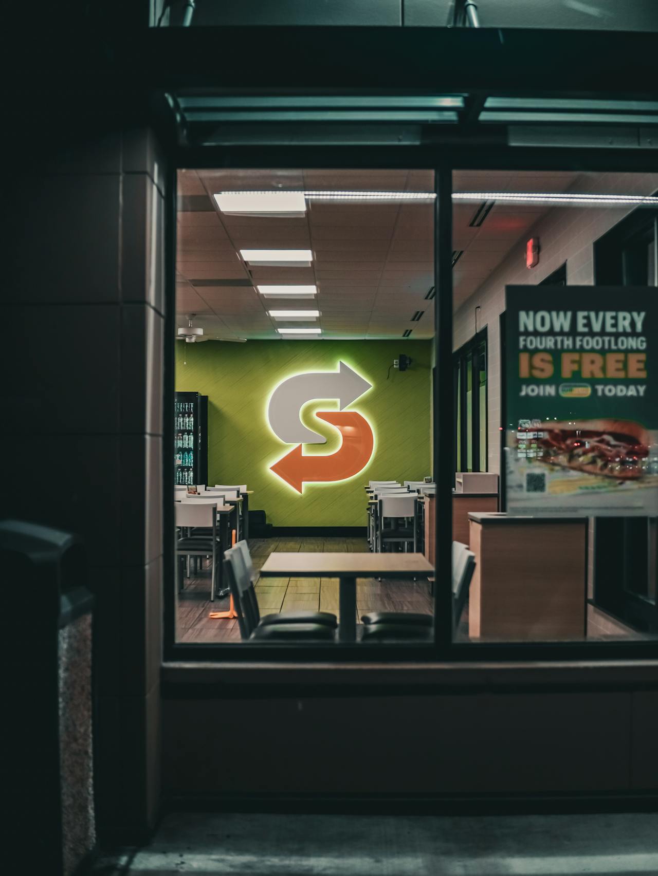
Integrate Your Brand Identity
An integrated wayfinding system is not just about guiding people from A to B; it also enhances the user experience by shaping how they perceive and interact with your brand. When every sign, indoor map, or graphic is constructed around the same look and feel, it makes the space easier to navigate through and imprints your brand in their memory. This sort of brand consistency matters everywhere—in offices, hospitals, schools, malls, or airports.
To make your wayfinding system seamlessly align with your brand, start by incorporating your brand’s colors, logos, and messaging. Maintaining consistency with these elements will make it much easier for people to immediately identify your brand. For example, using your logo’s signature blue on your directional signage or decorating floor directories with your logo ties the entire space together. Additionally, utilizing clear fonts and formats that harmonize with your other branding, such as on your website or printed materials, helps maintain message consistency wherever people encounter your brand.
Signage can extend beyond simple navigation. It can reflect your personality as a brand, showcasing your values, mission, and unique qualities. If your brand embodies trust and care, choose designs that are calming and airy. Conversely, if your brand is bold and modern, opt for strong lines and vibrant colors. The tone you use on your signs should align with the voice your brand employs elsewhere. Incorporating engaging messages or taglines can transform signs into more than just utilitarian tools, enhancing the overall indoor navigation experience.
The Living System: Maintenance And Evolution
A seamless wayfinding system in multi-room or multi-floor spaces is never static; it requires continuous attention and adaptation to enhance user experience. Employing robust materials and designing flexible indoor navigation solutions are central to its long-term operation. Additionally, testing how directional signage operates and listening to users ensures that the system remains usable, even as requirements evolve or emerging technologies like AI and AR influence indoor mapping.
Regular Audits
Frequent checkups enable crews to detect issues before they become large, particularly in indoor navigation systems. Regular audits identify missing or damaged signage and ensure screens display accurate information for effective indoor wayfinding. Staff and users can walk paths and provide feedback, injecting new perspectives and actual experiences. To keep score, every audit should record modifications, fixes, and updates. With a fixed schedule of monthly, quarterly, or post-major mundanity shifts, no realm goes unexplored. A transparent log assists in connecting patterns, such as recurrent problems in high-traffic hallways, and encourages data-informed strategies.
Material Durability
Opting for domestic, fade-proof materials is essential for creating effective indoor navigation solutions in bustling lobbies and outside walkways. Materials like anodized aluminum or high-pressure laminate perform well in most climates and resist scratches and sun damage. For outdoor signs, weatherproof coatings help maintain vibrant colors even after rain or sun exposure. Staff must understand the importance of these selections to quickly identify early indicators of wear, such as peeling or cracks, ensuring that inspections are conducted periodically or post-storm for timely replacements.
System Flexibility
Agile systems manage change, such as new flooring or redesigned offices, without major expenses. Modular sign units can exchange panels or arrows. Digital signage changes indoor maps or info quickly, with minimal interruption. Thinking ahead, designers anticipate future tech, like AR overlays or AI-powered guidance, so upgrades slot in seamlessly. User surveys can indicate whether specific demographics, such as disabled visitors, require additional functionality or more obvious indoor navigation, assisting the system to adapt along with its users.
User Feedback
Open feedback channels—QR codes on signs, online forms, or chatbots—give users a voice in enhancing the indoor navigation experience. It’s useful for teams to routinely review this input to identify trends like misleading paths or ambiguous symbols. Group discussions or interviews can probe further into daily pain points, ensuring the wayfinding system design stays fine-tuned to actual needs and evolving spaces.
Conclusion
With clear signs, smart maps, and easy routes, you can help people move with less stress. Effective wayfinding connects floors, rooms, and even digital resources, so that nobody stumbles around in confusion. That is where the Simple Icon and the Powerful use of Color and Easy Language work for more people, regardless of their origin. Brands can be stylish on signs without obstructing the path. Maintain signage and maps, monitor feedback,k and repair what doesn’t work. Little things like this give people confidence and security as they navigate challenging areas. To earn trust and appease crowds, audit your system regularly and update it. Experiment and be open to change, and make the path easy for everyone.
Frequently Asked Questions
1. What Is Wayfinding, And Why Is It Important In Multi-Room Or Multi-Floor Spaces?
Wayfinding assists visitors in navigating complex indoor environments. In multi-room or multi-floor buildings, effective indoor navigation and clear wayfinding minimize frustration, save time, and enhance the user experience for all.
2. How Do You Ensure A Wayfinding System Is Accessible To All Users?
Implementing universal design principles with transparent symbols, legible typography, Braille, and auditory signals enhances the user experience, ensuring intuitive wayfinding for everyone, including those with disabilities.
3. What Role Does Digital Technology Play In Modern Wayfinding Systems?
Digital solutions, from interactive indoor maps to mobile indoor navigation apps, help visitors navigate in real time, supplementing physical signs and enhancing the overall user experience.
4. How Can You Harmonize Physical And Digital Wayfinding Elements?
Ensure that both indoor navigation systems utilize the same symbols, colors, and terminology. This alignment between physical and digital components enhances user experience and facilitates a seamless navigation experience.
5. Why Is Maintenance Important For Wayfinding Systems?
Ongoing maintenance ensures that indoor navigation information remains up to date and that directional signage stays fresh, keeping the wayfinding system relevant as spaces and user needs evolve.
6. How Can You Integrate Brand Identity Into A Wayfinding System?
Employing brand-consistent colors, fonts, and logos enhances the user experience and establishes a unified wayfinding system design throughout the indoor spaces.
7. What Are The Key Psychological Principles In Wayfinding Design?
They depend on visual markers, landmarks, and intuitive wayfinding to create easily navigable routes. Thoughtful wayfinding system design helps users decide quickly and keeps stress at bay.
Make Your Mark: Discover Our Sign Shop’s Expert Sign Maintenance Services
In today’s competitive market, businesses often struggle to maintain their presence and ensure their signage continues to capture attention effectively. Without proper sign maintenance, your signs may become faded, damaged, or outdated, causing potential customers to overlook your location or question the quality of your services, leading to missed opportunities and revenue loss.
At It’s A Good Sign, we specialize in comprehensive sign maintenance that keeps your business standing out. Our range of services includes regular inspections, cleaning, repairs, updates, and preventative care to ensure your signs remain in top condition. With over 30 years of signmaking expertise and a nationwide network of professionals, we are committed to providing high-quality maintenance that preserves the integrity of your signage and sustains your brand’s visibility.
Investing in professional sign maintenance not only prolongs the life of your signs but also demonstrates to customers that you are dedicated to maintaining a professional and reliable image. Well-maintained signs communicate professionalism and reliability, making it easier for customers to find and choose your services. Let us partner with you to maintain your signage, ensuring it continues to meet your needs and contribute to your business’s ongoing success.
Ready to keep your business’s signs in pristine condition? Contact us today to request a maintenance plan and take the first step toward sustaining a lasting impression.
Disclaimer
The materials provided on this website are for informational and entertainment purposes only and are not intended to serve as professional advice. You should consult a qualified professional for advice specific to your unique circumstances or needs. Do not act or refrain from acting based on the content on this website without seeking appropriate guidance from an expert in the relevant field.
The information presented here may not reflect the latest developments in signage, design, or related industries. We disclaim all liability for any actions taken or not taken based on the content of this website to the fullest extent permitted by law.